Reading tk999 Without Reading: Icons, Colour and Visual Shorthand
Imagine muting the words on a betting screen and watching what still speaks. A green button pulses. A small football glyph sits beside a number. A red badge appears at the top of a card. Long before you read a single line of Bangla or English, the interface has already told you where to tap, what is live and what is risky. That is the quiet power of visual shorthand on tk999, a platform built for Bangladeshi users who often scan first and read second.
This essay looks at how much of the platform’s meaning arrives through icons, colour coding and layout rather than text, and where that visual language helps a Bangla-first reader or quietly misleads them.
Why the Screen Speaks Before the Sentence
Most people open a betting app in a hurry, often on a mid-range phone in daylight, with one eye on the screen and one on the world. Under those conditions, the eye does not read; it recognises. A shield icon suggests safety. A downward arrow suggests a download. A wallet symbol suggests money movement. These are not decorative choices. They are the first layer of instruction.
For a Bangla-first reader, this layer matters more than usual. English interface labels, betting jargon and regulatory wording can slow comprehension, but a well-chosen icon crosses that gap instantly. The trade-off is that icons carry no grammar. They cannot say “only if,” “except when” or “subject to verification.” Visual shorthand accelerates the first tap and hides the fine print.
The practical lesson is simple: treat the visual layer as a map, not the territory. It tells you where things are. It rarely tells you what happens after you arrive.
Icons: The Unwritten Vocabulary of a Betting Screen
Every betting interface develops its own dialect of symbols. On tk999, the recurring set tends to cluster around a few jobs: account access, money movement, game categories and live status. Learning that dialect takes minutes, and it is worth doing deliberately rather than by trial and error.
The core icon families
- Account and access: a person silhouette for login, a plus sign or outline for registration, a gear for settings.
- Money: a wallet, a card or a coin stack for deposits and withdrawals, often paired with a currency label.
- Categories: a ball for sports, cards or dice for casino-style games, a grid for the full menu.
- Status: a pulsing dot or a small “live” tag for events in progress.
None of these are universal. A card icon might mean “payment method” on one screen and “card games” on another. That ambiguity is the first place a hurried reader can go wrong.
Where icons help a Bangla-first reader
The biggest gain is navigation. A user who cannot quickly parse “Downloadable App” as a phrase can still recognise a phone with a downward arrow. Registration flows benefit too: a numbered sequence of small icons — profile, ID, payment, confirm — communicates order without a paragraph of instructions.
The second gain is confidence. Consistent icons repeated across screens build a mental model. Once a user knows that the wallet glyph always leads to money movement, they stop hunting through menus and start moving with purpose.
Colour Coding: The Fastest Signal and the Easiest to Misread
Colour arrives before shape. The eye registers a hue in milliseconds, which is why betting interfaces lean on colour to sort urgency, category and risk. The convention is broadly consistent: green for go or confirm, red for stop or loss, amber for caution, blue for neutral information. But conventions are cultural, and they are not always literal.
On a betting screen, red is doing double duty. It can mean “danger” in a warning banner and “live now” in a scoreboard. Green can mean “confirm” on a button and “positive movement” on a number. Colour tells you how to feel before it tells you what is true. That is useful for speed and dangerous for judgement.
Reading colour as a layer, not a verdict
A disciplined reader treats colour as a hint that prompts a second look. If a button glows green, check what it commits you to. If a card carries a red badge, ask whether it signals risk, liveness or simply a category. The colour is the question, not the answer.
For Bangla-first users, there is an extra wrinkle. Interface colour words in English — “cash out,” “claim,” “verify” — may be unfamiliar, but the colour itself is not. That makes colour a bridge. It also makes it a shortcut the platform can use to steer attention, so the reader should notice where the brightest colour sits and ask why.
Imagery and Layout: Where the Page Quietly Argues
Beyond icons and colour, the arrangement of the screen makes an argument. A large hero banner at the top says “this is the main event.” A row of small tiles below says “these are the options.” A sticky bottom bar with a wallet and a menu says “you will need these constantly.” None of this is neutral; it is a hierarchy of attention.
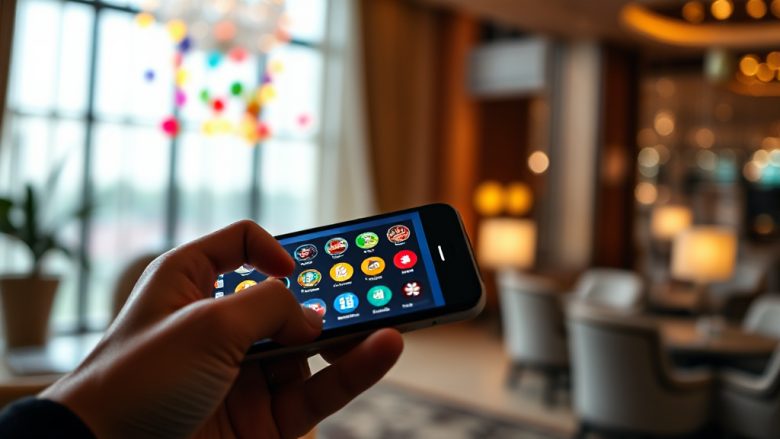
Photography and illustration add another layer. A smartphone mockup showing the app in use suggests ease and portability. A dashboard of numbers suggests control and information. A payment graphic suggests speed. These images are not evidence of anything; they are mood. Layout is the platform’s opinion about what matters most.
The helpful move for a reader is to invert the hierarchy. Ask what sits in the smallest type, the lowest contrast and the furthest corner. That is usually where the conditions, limits and cautions live. The visual system promotes the tap and demotes the caveat.
Where Visual Shorthand Fails
Visual language is fast, but it is not precise. Three failure modes are worth naming.
1. The ambiguous glyph
A card icon, a coin and a ticket can each mean two or three different things depending on context. When a symbol is reused across categories, the reader’s confidence outruns their accuracy. The fix is to confirm with the label, even when the icon feels obvious.
2. The colour collision
Red as danger and red as live status can appear on the same screen. A user who has learned “red means stop” may misread a live badge, and a user who has learned “red means live” may underreact to a warning. When one colour carries two meanings, slow down at every red element.
3. The confidence trap
The most serious failure is emotional, not perceptual. A clean layout, a friendly green button and a polished phone mockup create a feeling of safety that the visuals cannot actually guarantee. Registration, deposits and withdrawals involve rules, verification and risk that no icon can convey. The visual layer says “easy”; the text layer says “conditional.” A Bangla-first reader who relies on the first and skips the second is the most exposed user on the screen.
The remedy is not to distrust the design but to read it in the right order: let the visuals orient you, then let the words govern you. Icons and colour are excellent ushers and poor advisors.
A Short Close
Mute the words on a betting screen and you will still learn a great deal: where to tap, what is live, what costs money, what the platform wants you to notice first. That is the gift of visual shorthand, and on a Bangla-first screen it is a genuine bridge. But the same shorthand cannot tell you what you are agreeing to, how a withdrawal is verified or when a promotion expires. Read the icons for orientation, read the colour as a question, and read the small text for the truth. The screen speaks before the sentence; the sentence is still the part that counts.